GianlucaBookshelfBlog

2023-02-25

Masonry layout with React

https://assets.tina.io/02d04b15-35e4-489b-ad51-13f6dee14a94/masonry-layout-with-react/love page.png

Masonry is a grid-like layout that arranges elements to fill empty spaces and create an aesthetically pleasing grid. At Material, we use it on our "love page" to showcase social media posts and Tweets from our users.

Let's explore how to create this layout from the ground up using a React component.

Why implement Masonry from scratch

When solving a front-end problem, we should consider whether to use a third-party library or create our own solution. Advantages of third-party libraries such as react-masonry-component and material-ui/react-masonry include being already implemented and tested in production, while their disadvantages include a less flexible interface and no control over rendering performance.

In our use case, we want to display an ordered list of social media posts. The most relevant ones should be rendered at the top of the page. Each post has the same width, but the height varies depending on the content.

To produce a more uniform look, the first step is to discretize the heights. The minimum post height step will become the height of the CSS grid row.

We want to dynamically determine the number of columns based on the browser width for improved performance. Additionally, we must ensure the website works well with Server Side Rendering to make social media posts available for SEO.

We decided to implement the requirements from scratch using CSS Grid and standard CSS properties to control the look and feel. This design choice allows anyone with knowledge of CSS to make visual changes to the design.

General Architecture

To make a component work quickly, you should use as little JavaScript as possible and let the browser's CSS engine do most of the work. This will give the best performance for the user, as browsers are designed to work well with CSS.
CSS gridCSS grid

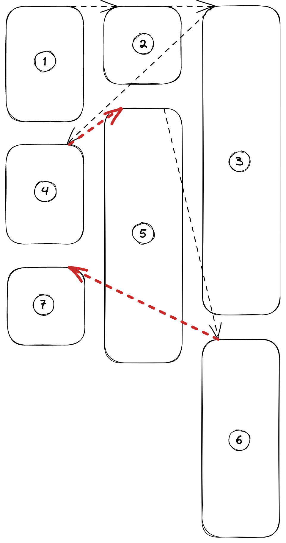
The CSS grid layout almost meets our needs, but we need to manually calculate the coordinates of each post in the grid system to preserve the vertical order. The default CSS grid positioning won't work, as it positions posts left to right without taking the vertical order into account.

CSS grid with manual element positioningCSS grid with manual element positioning

To accurately place each post on the grid, we need to know its height. Instead of trying to estimate it, we render invisible posts first to read their height directly from the DOM. This technique is better than guessing the height, as it takes into account paddings, font sizes, line heights, and any other CSS property of the post without needing a complex calculation. The downside is that it uses the first render on invisible components.

After calculating the position of each post in the grid system, we need to write the CSS properties style.gridColumnStart, style.gridRowStart, and style.gridRowEnd into the DOM nodes of each post. This provides the information necessary for CSS grid to render the posts in their correct positions, ensuring that they do not overlap.

Whenever the container's size changes, we recalculate the positions. To ensure optimal performance, we add a throttle to the resize handler, as it is called frequently and can result in excessive DOM manipulation.

Implementation

Let’s now see a simplified implementation of the component. Note that we are using standard CSS grid properties to control the layout.

These are the steps:

  1. Render invisible posts to get the actual height
  2. Calculate every post position on the grid and set the element CSS properties
  3. When a resize happens, re-render
1const MasonryWrapper = styled.div<{ minWidth: string }>`
2    display: grid;
3    grid-column-gap: 24px;
4    grid-row-gap: 24px;
5    grid-template-columns: repeat(auto-fill, minmax(80vw, 1fr));
6    grid-auto-rows: 6px;
7`;
8
9export const Masonry: React.FC<{}> = (props) => {
10    const { children } = props;
11    const masonryEl = React.useRef(null);
12
13    React.useEffect(() => {
14        // Calculate "column", "row start" and "row end"
15        // for every post
16        function calculateLayout() { ... }
17
18        function handleResize() {
19            if (!masonryEl?.current) {
20                return;
21            }
22            const grid = masonryEl.current;
23            // This is the same as step (1)
24            for (const item of grid.childNodes) {
25                // CSS grid index is 1-based
26                item.style.gridColumnStart = 1;
27                item.style.opacity = 0;
28            }
29
30            // Give the browser time to render the invisible posts
31            window.requestAnimationFrame(calculateLayout);
32        }
33
34        // Throttled version that prevents excessive DOM manipulation
35        // when resize is happening
36        const throttledHandleResize = throttle(handleResize, 100);
37
38        // 2. Initial layout calculation
39        // It's guaranteed to run after the post height is
40        // already defined
41        calculateLayout();
42
43        // 3. Add event listener to recalculate layout on resize
44        window.addEventListener('resize', throttledHandleResize);
45
46        // Remove event listener on cleanup
47        return () => {
48            window.removeEventListener('resize', throttledHandleResize);
49        };
50    }, []);
51
52    return (
53        <MasonryWrapper minWidth={minWidth} ref={masonryEl}>
54            {React.Children.map(children, (child, i) => (
55                <div
56                    key={i}
57                    // 1. Render the invisible posts
58                    style={{ opacity: 0 }}
59                >
60                    {child}
61                </div>
62            ))}
63        </MasonryWrapper>
64    );
65};

The calculateLayout() function is the core of our component, it’s where we assign a position in our grid system to every social media post.

1function calculateLayout() {
2    const grid = masonryEl.current;
3
4    // Read the grid parameters from the DOM
5    const numColumns = window
6        .getComputedStyle(grid)
7        .getPropertyValue('grid-template-columns')
8        .split(' ').length;
9    const rowHeight = parseInt(
10        window.getComputedStyle(grid).getPropertyValue('grid-auto-rows'),
11        10
12    );
13    const rowGap = parseInt(
14        window.getComputedStyle(grid).getPropertyValue('grid-row-gap'),
15        10
16    );
17    // This array keeps track of the first available row in every column
18    // 1-based index for CSS grid system
19    const firstAvailableRowInColumn: number[] = range(numColumns).map(() => 1);
20
21    // Selects the column that has an available space with minimum Y
22    function getFirstColumnWithMinAvailableRow() {
23        return firstAvailableRowInColumn.indexOf(
24            min(firstAvailableRowInColumn)
25        );
26    }
27
28    // For every card, write the coordinates directly in the
29    // DOM node style
30    for (const item of grid.childNodes) {
31        const column = getFirstColumnWithMinAvailableRow();
32        const rowStart = firstAvailableRowInColumn[column];
33
34        const content = item?.querySelector('.content');
35        // Get the card height from the DOM
36        // note that we have this information because we render
37        // the card at least once
38        const contentHeight: number =
39            content?.getBoundingClientRect().height ?? 0;
40        const container = item?.querySelector('.container');
41
42        // Calculate how many rows are needed by the card
43        // approximating by excess
44        const rowSpan = Math.ceil(
45            (contentHeight + rowGap) / (rowHeight + rowGap)
46        );
47        const rowEnd = rowStart + rowSpan;
48
49        // Mark the space taken by the card as not availble anymore
50        firstAvailableRowInColumn[column] = rowEnd;
51
52        // Set the card coordinate
53        item.style.gridRowStart = rowStart;
54        item.style.gridRowEnd = rowEnd;
55        // CSS grid index is 1-based
56        item.style.gridColumnStart = column + 1;
57        // Now we can show the card because position and size are correct
58        item.style.opacity = 1;
59
60        // Make sure the height is a multiple of the row size
61        container.style.height = `${
62            rowSpan * rowHeight + (rowSpan - 1) * rowGap
63        }px`;
64    }
65}

Final thoughts

The Masonry layout we just implemented can be used to display multiple similar elements neatly arranged in a grid-like system, avoiding the "everything fits into a square" look. The advantage of our CSS grid implementation is that we can use any of the standard CSS grid layout properties to style it. This allows us to dynamically adjust the gap between elements and the number of columns based on our responsive design. This isn't something we can easily do with third-party libraries, as they usually require non-standard layout properties or access to their internals, which I try to avoid when possible.

In the future, there are several improvements we can make to our component:

  1. Use IntersectionObserver instead of getBoundingClientRect() for better performance.
  2. Use ReactDOM.render() or ReactDOM.createPortal() to render the posts synchronously in a separate hidden container, instead of using the first component render.